Logo Design Tailored
To Local Styles & Trends
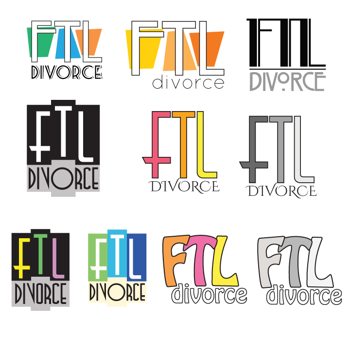
Fort Lauderdale’s South Florida vibe has its own retro style & signature tone. Capturing this vibration was key to developing the logo of FTL Divorce. The client wanted a strong brand that imbued a sense of the local scene and specifically mentioned the iconic Elbo Room for inspiration. See our initial sketches below.
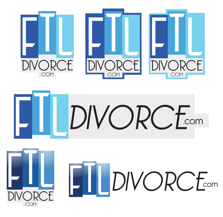
After narrowing down which aspects of the sketches worked, we started to build our color scheme. We leaned towards blue, a color representing stability & trust. While FTL Divorce wanted to capture that funky retro vibe, the subject matter still commanded a serious tone.
Having honed in on a particular style, color palette & tone, we provided a few more options.
Finally we made the finished logo.


