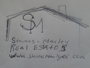
Logo design projects often start out like this. You come to us with an idea… maybe even a sketch, like the one below that Stevens and Manley brought to us. They wanted to convey a strong, regal style for their brand, and sketched us their idea, a traditional typographic logo, playing around with the idea of adding an iconic element to it.
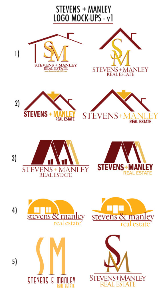
Once we understand your branding needs and style wants, we get to work drafting up several mock-ups. In this case, the first line of mock-ups are very similar to the original sketch provided to us. The following two lines show variations using traditional real estate iconic imagery (roof/home) and variations in typography. The third line provides a more modern icon in contrast, while the fourth line includes deco & classic typographic logos.
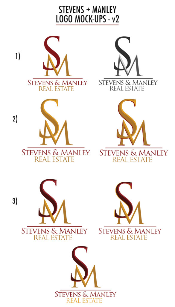
We sent these over to Stevens & Manley for review. They decided on the traditional typographic logo in line 5, but also liked some of the shading from line 1. We took the elements they liked, along with a few other changes to create another set of mock-ups, seen below. From this they chose their final logo!


